Analytics
Business analytics in MeerPartners: clicks, conversions, spend, CR and EPC over a 7/30/90-day period, per-offer breakdown and spend charts.
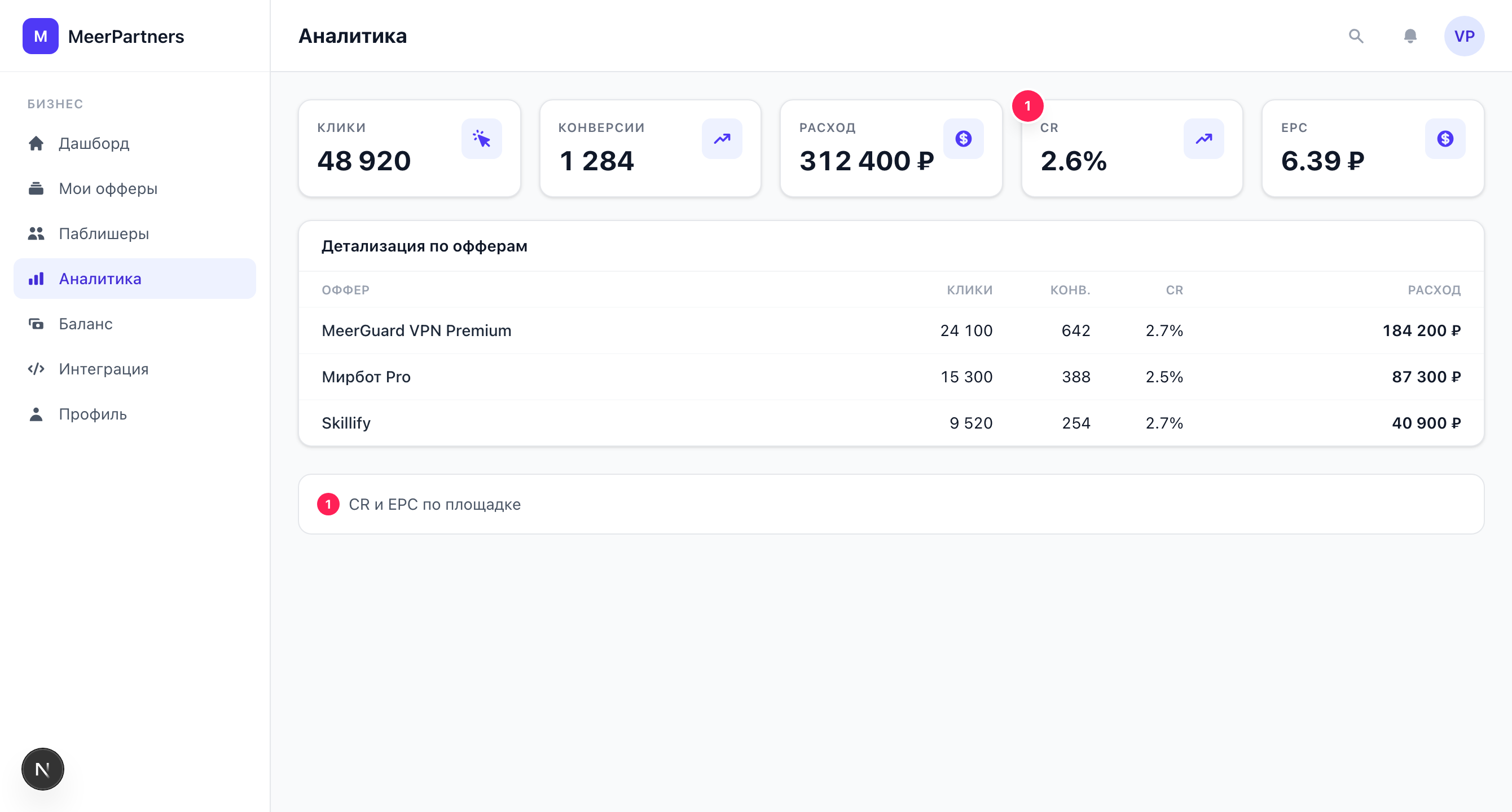
The Analytics section (/m/analytics) is a detailed picture of your offers' performance: how much traffic came in, how much converted, what each conversion cost, and which offer spends the budget more effectively. Unlike the Dashboard with its quick summary, here you get a per-offer breakdown with the CR and EPC quality metrics.
7 / 30 / 90-day period
At the top — a period switcher: 7 days, 30 days, 90 days. The selected period applies to all metrics, charts and the table. To assess trends, compare a short window (7 days) with a long one (90) — that shows whether an offer is accelerating or fading.
KPI metrics
| Metric | What it shows |
|---|---|
| Clicks | How many tracking-link clicks on your offers there were for the period. |
| Conversions | How many target actions were counted (arrived via postback). |
| Spend | The sum of rewards to publishers for the period, in your currency. |
| CR | Conversion Rate — the share of conversions out of clicks (conversions ÷ clicks). |
| EPC | For business — the average cost per click (spend ÷ clicks). |
How to read CR and EPC
CR shows the quality of traffic and funnel: a high CR means users reach the target action. EPC shows what one click costs you on average: the lower the EPC at a stable CR, the more efficiently the offer spends the budget. The influencer sees these same metrics, but for them EPC is earnings per click, while for you it is the cost.
Per-offer breakdown
The "Per-offer breakdown" table splits the metrics by each offer:
| Column | What it shows |
|---|---|
| Offer | The offer name. |
| Clicks | Clicks on links to this offer. |
| Conv. | Counted conversions. |
| CR | The conversion rate of this specific offer. |
| Spend | How much was spent on rewards for the offer. |
| EPC | The average cost per click for the offer. |
This way you immediately see which offer "carries" the program and which burns budget with no return.
Charts
- Clicks and conversions by offer — a bar chart that clearly compares traffic volume and results for each offer.
- Spend by offer — the budget distribution: where the money goes.
If there is no data for the period, "No data for the period" is shown.
How to analyze spend
A few practical techniques:
Match spend against conversions
High spend with a low number of conversions is a reason to check whether low-quality or fraudulent traffic is coming in.
Watch CR by offer
A sharply low CR for one offer while others are normal signals a need to check the landing, geo or offer terms.
Compare EPC between offers
An offer with a noticeably higher EPC costs more for the same result — reconsider the rate or model.
Change the period
Compare 7 and 90 days to tell a one-off spike from a sustained trend.